Time for a fun post! In the before times, when this used to be a fun travel blog ( I mean, back when there was travel), I made a series of posts about terrible apartment photos that we encountered on our great circumnavacation. Of course, it all started with Taiwan, but we quickly found that both France and Croatia have their own unique contributions. We’ve looked for apartments on and off again this past year, and while the apartments have changed, the quality of the bad photos have not. Thus, I am proud to present another edition of Terrible Apartment Photos.
The Bad Bathroom Photo
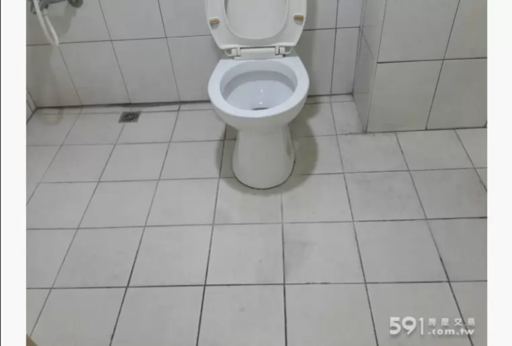
Sometimes, you just have a bad bathroom photo. They are tricky spaces to take good photos of, but sometimes, you find examples that you just know can be improved on. For example, it’s great to know there’s much room for your legs when you’re sitting on the throne, but it makes you wonder: is there something wrong with the rest of the room that you didn’t want to capture it in this photo?
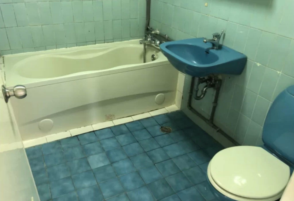
Other times, you have a great bathroom picture that shows all the relevant parts, but it may have been better not to take this picture at all, because everything is too violent of a shade of blue. I actually found it terrifying to look at this for a sustained period of time. There’s no way I could actually go in there, in either sense of the word.
The Ghost Arm Photo
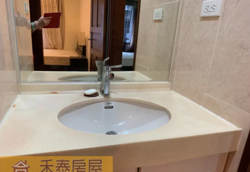
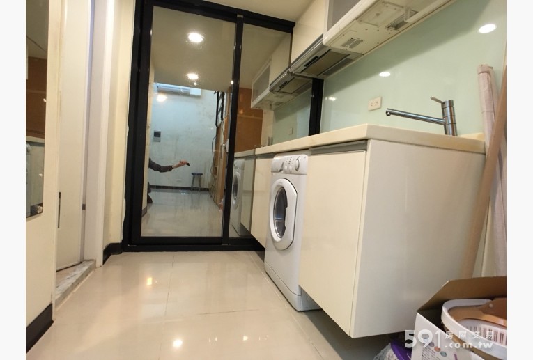
I sympathize with Taiwanese brokers who want to take nice pictures of apartments that don’t feature themselves haunting the back of a mirror or a reflective pane of glass. However, they usually end up making themselves more conspicuous by trying to hide their main body and just showing their floating arm in the photo with their phone or camera at the end of it. This second one is actually my favorite example of this genre.
The Incomprehensible Layout Photo
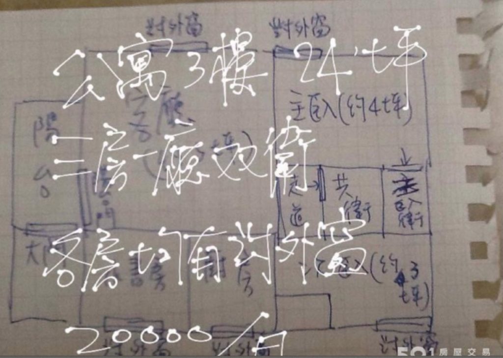
I appreciate it when landlords go to the trouble of creating a little layout or something rather than making you put all the pieces together yourself by minutely examining each photo. However, some people just go overboard. I mean, I read Chinese, and this was still nearly incomprehensible to me. Why go to the trouble of drawing an entire layout and labeling everything, and then using a stylus to scribble more details about the apartment on TOP of that?
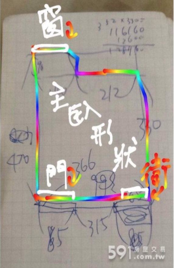
And no, it doesn’t get any better when you use multicolored font to do it.
The Twin Peaks Room
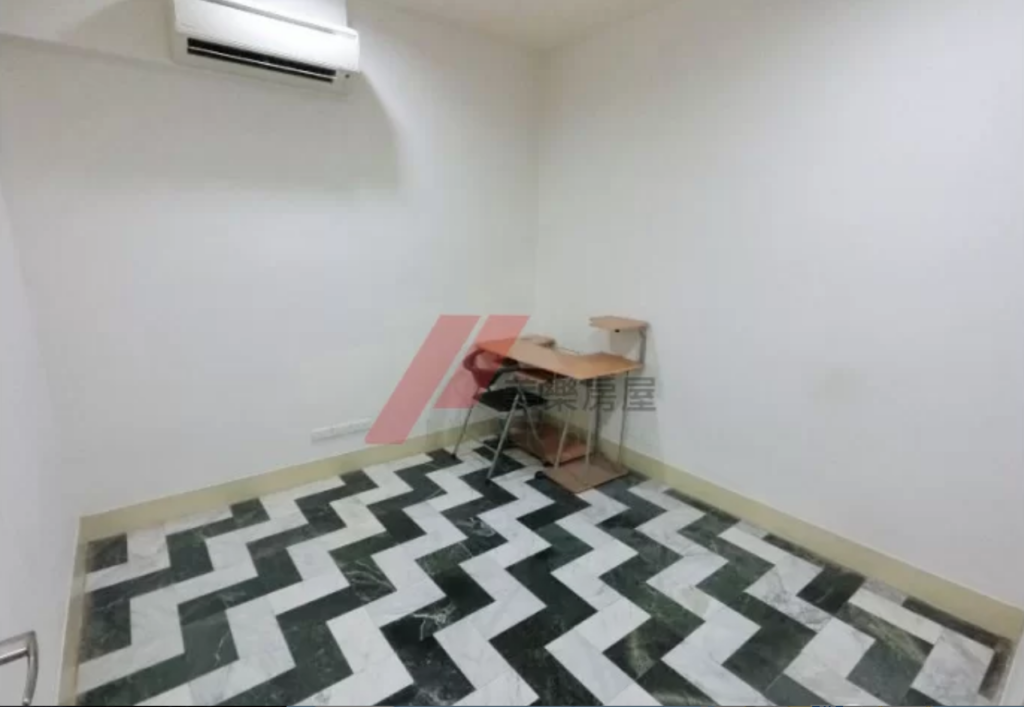
This room won the lottery: no windows AND a crazy dizzy patterned floor. It would be a dire punishment indeed to have to sit at that corner desk and stare at the wall.
The What Happened Here Photo
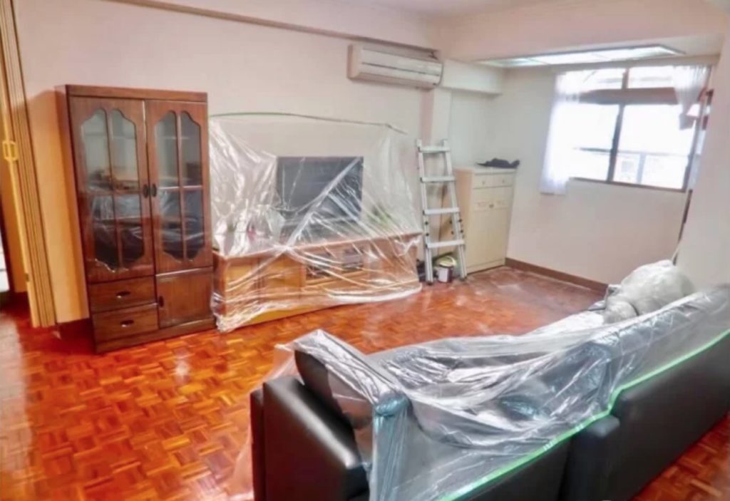
I would be disappointed if this apartment didn’t actually come like this.
The Unrealistic Staircase Photo
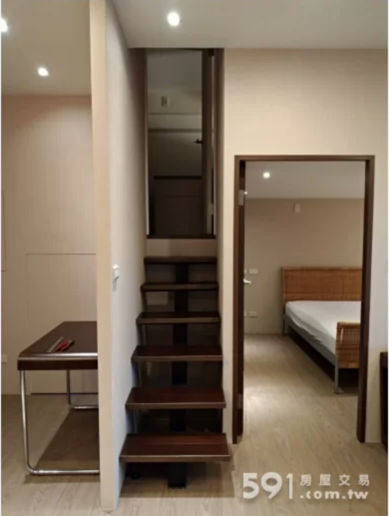
On the downside, you can’t walk up these stairs if you’re wider than the average Taiwanese person or happen to be holding something like a child or a box that is skinnier than the width of these stairs. On the bright side, you would be perfectly safe walking up these stairs while drunk, because if you stumbled, the walls would hold you up. You win some, you lose some.
The Tiger King Apartment Photos
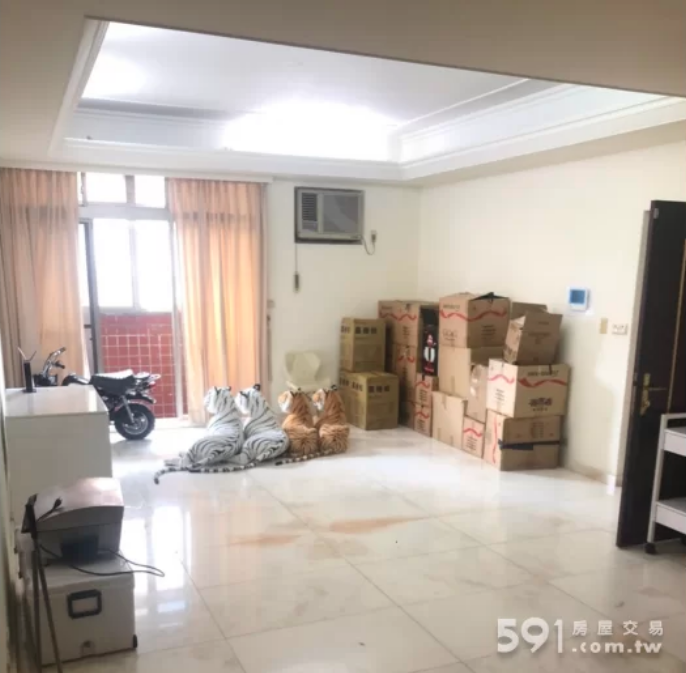
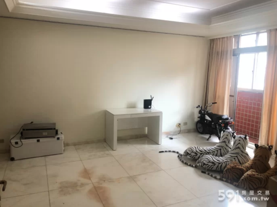
I saved the best for last: sometimes, an apartment just evokes questions that have no answers. Who is the amazing person moving out of this place? Why did they have four plush tigers, but two of two different types? Why are these four tigers all basking in the light? Do they have their backs turned on the stains on the floor for a particular reason? Is that a child-sized scooter or motorcycle in the corner? Or maybe, tiger-sized? We’ll never know, but we’ll always enjoy the speculation.

